Friday, 29 October 2010

Liquid Stone

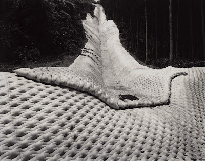
Fabric formed concrete structures are often used to stabilise vast areas of landscape that are exposed to some of the most erosive forces of natures. These types of erosion control systems usually involve a gigantic woven lattice of fabric forms, that are draped over the endangered landscape. The Fabric form is then filled in situ with concrete and adapts itself to the uneven contours, curves and topography of the site. The process of formation is akin to the processes of erosion it is protecting against. The resulting expansive concrete drapes intimately connect with the landscape like a Christo wrap, and act as reminder of man’s continued resistance with the sculpting forces of nature.

Dams across the globe also directly interface with the creative energies of the environment and often result in some of the most awe inspiring feats of human ingenuity in attempting to harvest these forces.

Toshio Shibata, a Japanese photographer, beautifully captures these and other concrete landscapes in his work. The stark black and white images capture the animation, fluidity and reveal the sculptural qualities of beautifully engineered concrete across Japan’s terrain.

Thursday, 29 July 2010

Dealing with Density – The Images of Christoph Gielen

On a recent trip to the fabulous Las Vegas, before a weekend of decadence and debauchery begun, I was able to fly over parts of the Nevada desert and experience from 20000 ft some of the interesting patterns employed in some of mankind’s attempts to deal with the density of human habitation.

From that height and in the confines of a pressurised steel fuselage, cities and towns appear quiescent and peaceful. The underlying organizational principles of these places, that may have once started life as a few lines etched on architect’s drawing board, are also clear to see. Some of these strategies work in sympathy with the landscape whereas others attempt to dominate and control it; some are simply subservient and out of balance.

As I had deliberately forgotten my camera, not wanting any pictorial evidence from the possible events of the forthcoming weekend, I was unable to capture these beautifully clear views and was happy to let them pass into memory to wait for a moment of reflection. A few weeks later whilst sitting at my desk, I turnarounded to see one of my colleagues, happily procrastinating on the internet to some beautifully captured images of those very views I had seen from 20000 feet.

The photographic work was of Christoph Gielen, and he has been documenting suburban housing formations and its accompanying infrastructure across the North American continent for a number of years. His work is an insight into our continued and unrestrained growth into the expansive landscape of our planet. His micro light aerial views reveal a lack of balance in our monoculture development and prompt us to question how we use our ever dwindling resources. These images are a sobering and poignant reminder of our dissonance with the natural world...particularly when you’ve has just returned from the excesses of Vegas.

Friday, 23 July 2010

Decay and Complexity

My non architect friends often enjoy teasing me about my taste in architectural dexterity by joking that I always like things that look like they’re on the brink of collapse. And they’d be right, I am often allured and seduced by buildings that have been the victim of a neglectful relationship, that are no longer able to resist the earth’s gravitational pull or that have been led astray by the roots of a feral neighbour. As long as I have not been involved in the design and procurement of a collapsed building and do not live in one, they are easy to admire as there is a fascination, a beauty, and a poetic romance about a building that has been gently teased apart by the gradual processes of time.

We are often stirred and excited by the complexity, and its resultant ambiguity, of slowly accumulated patterns of decay. Like growth lines in a tree trunk or strata in a rock formation, the complex patterns of decay reveal personal biographies and intimate stories of a building’s life, and it is the speculation and interpretation of these events that captivates the imagination.

Buildings in decay can be a beautiful photographic subject. Just type ‘buildings in decay’ into a Google image search to see the extensive catalogues of numerous photographers around the world who capture these moments of deterioration. Below is a collection of one such search.

Thursday, 22 July 2010

A Reverential Ecology

At a recent RIBA lecture Satish Kumar, a prominent Indian philosopher and ecological theorist argues the importance of coupling a genuine and sincere philosophical approach with our technological advancements when asking how to live sustainably. He argues that climate change is a consequence of our actions and that it is imperative that we deeply examine the root causes - our attitudes and the way in which we relate to the natural world. The current paradigm that exists is leading to climate change, the exhaustion of fossil fuels and depletion biodiversity and we appear solely dependant on technology progression as the solution. In making the required paradigm shift Kumar encourages us to take responsibility and ask ourselves if we are living in fair, sustainable and joyful way in relating to the natural world.

He calls the required relationship with the natural world a ‘Reverential Ecology’: ‘Everything we receive from nature is a gift; whether it is food, water, sunshine or anything else; everything is a gift. This is the symbiotic relationship which equips us with, humility, wonder and reverence. Nature is not there to be plundered or exploited rather it is there to be cherished and celebrated.’ It is through this ‘friendship of mutual understanding and respect’ with the living environment that a sustainable way of living will naturally emerge.

Many architects are beginning to question the existing conceptual framework for the production of the built environment and are finding answers inspired from the natural world. Here I show two buildings that to me represent a ‘Reverential Ecology.’ I find them both beautifully sustainable, and I doubt neither architect was ever guided by BREEAM assessment or Sustainable code of practice to produce them.

They are both chapels set in idyllic locations, one is by the Hungarian ‘Organic’ Architect, Imre Macovecz and the other is a creation of Peter Zumthor. Both capture the imagination, and pay homage to their surroundings, without the use of grandiose views and marvellous vistas but instead they do it in an intimate and private way, which encourages the energy of the landscape to assist with the quiet contemplation of the chapel’s users.

Saturday, 17 July 2010

The Manufactured Landscapes of Edward Burtynsky

This incredible collection of images depicts the huge industrialised processes that are driven by mankind's untethered desires for consumerism. They echo the sentiments of Godfrey Reggio's film Koyaanisqatsi, a hopi word meaning 'life out of balance', which beautifully depicted man's changing relationship to his environment as our technological advancements begin to replace the nurturing habitation of the natural environment.

Edward Burtynsky's large format images are beautiful representations of an uncomfortable truth that points to our need to immerse ourselves in technology and the artificial, perhaps as a result of our insecurity in struggling to understand the basics of the human condition. The great Cedric Price once asked 'technology is the answer, but what is the question?'

Thursday, 18 February 2010

Choisy’s Favoured Perspective Hinge

The path from architectural conception to the architectural execution of a built work, is guided predominantly, from the architects perspective, by a wide and diverse range of representative tools. Architects, using 3 dimensional computer visualizations, to detailed CAD plans or the carefully cut section and other modes of spatial communication, transcribe and precisely construct a seemingly clear and scientifically objective representation of the piece of architecture to be realized. Our advancements in technological construction processes and spatiotemporal virtual representation reaffirm with ever increasing precision this assumption of a directly mapped correspondence between drawings and completed built form. However, there exists between all modes of Architectural representation and the reality of which they describe a ‘Perspective Hinge’1.

This Perspective Hinge - the projective tools of architectural representation so often taken for granted as we forget its importance in the path from architectural conception to built form, is a perspective stance and view point indicating current philosophical and scientific advances that have been built upon from the traditions of descriptive geometry.
In our professional careers, the drawing often becomes a slice of a dissected whole, acting as objective, precise and accurate information fit for not much other purpose than a swift translation into built form and the space from which these projections are based is rarely considered.

In looking at the axonometric projections of Auguste Choisy, (the 19th Century French Engineer who documented the structural concepts and principles of great buildings in history) we see wonderful examples of using the perspective hinge to push abstraction and create a representation celebrating the objectivity of precise measurements. In his work ‘the objectified projection rids itself of a gravity bound, embodied, and orientated subject’2 and presents Choisy’s thesis of objective truth.
For me, this use of the perspective hinge to illustrate impossible views, from the worm’s eye particularly always creates a sense of excitement and although the drawings may be considered in one sense a celebration of the objective and the precise, the engaging and at times optically confusing view point draws our attention to the subjective by showing how our act of observing effects the observed.

1 Taken from Alberto Perez Gomez and Louise Pelletier in their fascinating book ‘Architectural Representation and the Perspective Hinge’
2 ibid.

Tuesday, 2 February 2010

The Panoramic Diorama

Whilst browsing through an avant garde high gloss large format international architectural journal, as I occasionally like to do when trying appear sophisticated and high brow on the underground, I actually caught sight of something that completely captivated me. A sudden romantic sense of bohemian reverie arose in me as I gazed into a double page spread depicting a beautifully aged artist’s studio. My eye was immediately drawn into excitedly inspecting the studio’s melancholic sediment, slowly accumulated from years of intense work and habitation of a pensive and prolific painter. I turned the page and again hungrily devoured the visual feast of the next double page spread, this time gorging myself on what I thought to be the artist’s bathroom, gently weathered by moss, house plants and the placid daily routine of a creative soul. I flip backwards to the beginning of the article, intrigued to find out whose house I was peering into. Ronan Jim Sevellec was the artist, there was an image of him standing next to some paint brushes, somewhere I presumed to be in the house I was just looking at. I begin to read the article and to my surprise quickly discover that the romantic panoramic images I had just been studying were in fact photographs of intricate display model dioramas not much bigger than a shoe box! Intriguing and poetic the miniature worlds of Ronan Jim Sevellec demonstrate the wonders of making spaces by making places, coloured by the idiosyncratic movements of an individual, who in this case actually resides in the mind of the artist.

Friday, 15 January 2010

Ganzfelds, Śūnyatā and the Restless Eye

Captivating, entrancing and engaging, the tactile and visceral experiences of Anish Kapoor’s last exhibition at the RA, wonderfully explore and investigate self reflexive optical effects and immersive surfaces, tools that were perhaps once common place in Architectural lexicon. Upon entering the exhibit we are immediately confronted by one of Kapoor’s signature elliptical voids fabricated from an impressive weight of Coreten steel. The surrounding material around the vagina like opening fills our entire peripheral vision convincing us that it is a giant solid volume penetrated by a sensuous hole. As we begin to circumambulate the structure expecting it to occupy the entire room we realise the illusion created by filling our peripheral vision; the solid volume reveals itself as a thin facade and we see the solidity of the void. This is a great example of an architectural Ganzfeld effect.
The Ganzfeld, German for entire field, is more commonly associated with parapsychology experiments where test subjects experience homogeneous and un patterned sensory stimulation to produce effects similar to sensory deprivation. The lack of discernible sensory input is conducive to internal imagery is comparable to the technique of ‘Scrying’ (which appears in many traditions in various forms) where smooth, polished, translucent and reflective surfaces are used to facilitate visions believed to be from a God, Spirit or divine realm.
Kapoor’s sculptures echo and use this very tool of homogenous and un patterned sensory stimulation to produce art works that encourage states of ‘inwardness’ that feel somewhat surreal and other worldly or Spiritual.

His giant reflective blobs and mirrors certainly produce this effect and are some of the most engaging and entertaining pieces in the exhibit. Kapoor describes the effect of the highly polished reflective concave and convex surfaces as seeming to ‘reverse, affirm and negate’ the space and view. The objects have a threshold and a presence that one enters into and the slightest movement of you head and body, i.e. your perceptual position, creates a dynamic and fluid reflection that is totally absorbing.
But Kapor is not the first to use these optical techniques on such a scale. The ‘Architectural Ganzfeld’, has been around for millennia, and has often sought the most intensive craftsmanship and production techniques for its execution. The first that springs to mind is the hypnotic geometric patterns found in the fractal mosques of the middle east.
Here intricate Islamic geometry is used over such a large architectural scale that the individual detail and intense pattern is lost until close examination and an engulfing, homogenous surface that the eye can’t quite settle on is created. The shimmering fluctuating effect produces responses akin to the ‘inward projections’ of the Ganzfeld and it is clear to see why such an architectural tool would be used in a place of worship.
Kapoor’s work also combines other optical effects to create these giant immersive fields. One of his most refined techniques is the use of pure colour and pigment to create surfaces with immense spatial and expansive qualities. The perceived depth in the colour of Kapoor’s work reminds me of the depth of colour techniques employed by the Tibetan monks in their Shrine rooms.

Śūnyatā, in Mahayana traditions of Buddhism literally means ‘emptiness’ and refers to the insight that arises from realising the impermanent nature of all form. The concept of formlessness, impermanence and emptiness often manifests itself in the processes used to create Buddhist vernacular buildings. Woodwork panels, walls of shrine rooms as well as traditional Thangka paintings often go through a laborious process of colour application that is symbolic of Śūnyatā and has effects akin to pigment works of Kapoor. Bright colour, made from pigment collected from natural materials and stones is mixed with egg yolk and painstakingly applied on to surfaces in extremely thin layers. Often a complimentary colour such as green, is first applied to a surface that will eventually be red. The layers of colour are built up slowly, sometimes between 50 – 100 layers, and result in a colour so intense the eye can not rest on the surface and an incredible perceived depth occurs. In Thangka paintings Buddhas and deities appear to have shimmering auras, when used in the architectural scale - rooms appear to subtlety pulsate with colour and the walls seem less solid and more ephemeral.